Control Elements

Abstract

Gain an overview of the different control elements that make up Massive X's UI.

Massive X's user interface features a number of different controls. The following overview explains how to interact with them using a mouse.

Name

Image

Description

Key Commands

Dropdown menu

MX_Control_Elements_Dropdown_Menu.png

Used to select from a list of options relating to the respective section or function.

  • Click opens or closes the dropdown menu.

  • Click on any of the available entries selects the corresponding option and closes the dropdown menu.

Dropdown menu

(with display)

MX_Control_Elements_Dropdown_Menu_Display.png

Used to select from a list of options relating to the respective section or function. The selected entry is visualized in the display.

  • Click on either the name or the display opens or closes the dropdown menu.

  • Click on any of the available entries selects the corresponding option and closes the dropdown menu.

Dropdown menu

(extended)

MX_Control_Elements_Extended_Dropdown_Menu.png

Used to select from a list of options relating to the respective section or function.

  • Click opens or closes the dropdown menu.

  • Click on any of the available entries selects the corresponding option and closes the dropdown menu.

  • Placing the cursor over the dropdown menu shows arrow icons that can be used to select the previous or next entry from the list, respectively.

Unipolar knob

(with modulation)

MX_Control_Elements_Knob_Saturn_Unipolar.png

Used to adjust parameters in the range of 0% to 100% from left to right.

  • Click + drag up/down changes the control’s value.

  • Double click sets the control to its default value.

Bipolar knob

(with modulation)

MX_Control_Elements_Knob_Saturn_Bipolar.png

Used to adjust parameters in the range of -100% to +100% from left to right. The center position is 0%.

  • Click + drag up/down changes the control’s value.

  • Double click sets the control to its default value.

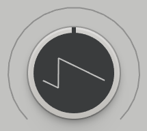
Wavetable knob

MX_Control_Elements_Knob_Wavetable.png

Used to adjust the wavetable position of the corresponding Wavetable oscillator. The display at the center of the control visualizes the resulting waveform.

  • Click + drag up/down changes the control’s value.

  • Double click sets the control to its default value.

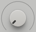
Unipolar knob

MX_Control_Elements_Knob_No_Mod_Unipolar.png

Used to adjust parameters in the range of 0%-100% from left to right.

  • Click + drag up/down changes the control’s value.

  • Double click sets the control to its default value.

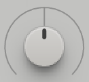
Bipolar knob

MX_Control_Elements_Knob_No_Mod_Bipolar.png

Used to adjust parameters in the range of -100% to +100% from left to right. The center position is 0%.

  • Click + drag up/down changes the control’s value.

  • Double click sets the control to its default value.

Macro knob

MX_Control_Elements_Knob_Macro.png

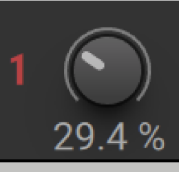
Used to adjust parameters assigned to the Macro. Refer to Macros and MIDI Control.

  • Click + drag up/down changes the control’s value.

  • Double click sets the control to its default value.

Macro icon

MX_Control_Elements_Header_Macro_Icon.png

Used to assign a Macro to parameters. Refer to Macros and MIDI Control.

  • Drag + drop onto a control or a modulation slot assigns the Macro to the corresponding parameter.

Controller icon

MX_Control_Elements_MIDI_Controller.png

Used to assign the respective midi controller to parameters. Refer to Macros and MIDI Control.

  • Drag + drop onto a control or a modulation slot assigns the MIDI controller to the corresponding parameter.

Page tab

MX_Control_Elements_Navigation_Bar_Page_Tab_Voice.png

Used to show the respective page in the Editor.

  • Click shows the page in the Editor.

Modulation source tab

MX_Control_Elements_Navigation_Bar_Page_Tab_Modulator.png

Used to show the respective modulation source in the Editor.

  • Click shows the modulation source in the Editor.

Modulation icon

MX_Control_Elements_Navigation_Bar_Modulation_Arrow_Icon.png

Used to assign a modulation source to parameters. Refer to Assigning Modulation.

  • Drag + drop onto a control or a modulation slot assigns the modulation source to the corresponding parameter.

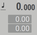
Pitch control

MX_Control_Elements_Pitch_Box.png

Used to control the pitch and pitch modulation amounts of components that track MIDI pitch.

  • Click + drag on the integer number changes the pitch in semitones.

  • Click + drag on the decimal places changes the pitch in cent.

Numeric control

MX_Control_Elements_Numeric.png

Used to adjust parameters in a specific range of values.

  • Click + drag up/down changes the control’s value.

  • Double click sets the control to its default value.

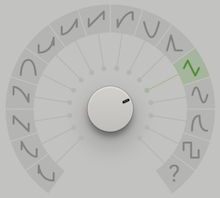
Rotary selector

MX_Control_Elements_Knob_Rotary_Selector.png

Used to select from a predefined set of different states or values.

  • Click + drag up/down changes the control’s value.

  • Double click sets the control to its default value.

  • Click on icon in circle sets the corresponding value.

Slider

MX_Control_Elements_Slider.png

Used to adjust parameters in the range of 0% to 100% from bottom to top.

  • Click + drag up/down changes the control’s value.

  • Double click sets the control to its default value.

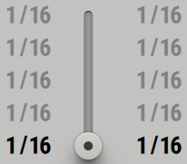
Quantized slider

MX_Control_Elements_Quantized_Slider.png

Used to select from a user-defined set of different states or values.

  • Click + drag up/down changes the control’s value.

  • Double click sets the control to its default value.

  • Click + drag on any of the adjacent numbers changes the corresponding value.

Function button

MX_Control_Elements_Button_Toggle.png

Used to switch functions on or off.

  • Click toggles between the control's active and inactive state.

Module button

MX_Control_Elements_Button_Module_Enable.png

Used to switch modules on or off.

  • Click toggles the module's bypass function.

Auxiliary button

MX_Control_Elements_Button_Aux_Function.png

Used to switch auxiliary functions related to adjacent controls on or off.

  • Click toggles between the control's active and inactive state.

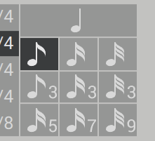
Mode selector

MX_Control_Elements_Button_Selection_Grid.png

Used to select one of several modes.

  • Click on one of the buttons in the mode selector selects the corresponding mode.

Routing module

MX_Control_Elements_Routing_Module.png

Used to make connections between modules on the Routing page.

  • Click + drag moves the module to a new position.

  • Right click toggles the modules bypass function.

  • Double clock removes all connections from the module.

  • Click + drag from an output node to an input node creates a connection. Alternatively, successive clicks on the two nodes can be used.

Parameter readouts for knobs

MX_Parameters_Readouts_Knob.png

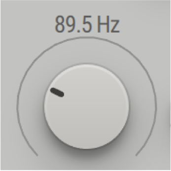
Used to display the exact value of a knob control.

  • Hover over a knob to display the parameter value above the control.

  • Click + drag the control to adjust the parameter whilst displaying the value.

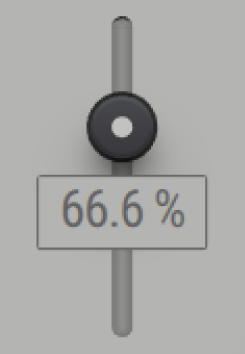
Parameter readouts for sliders

MX_Parameters_Readouts_Slider.png

Used to display the exact value of a slider control.

  • Hover over a slider to display the parameter value below the control.

  • Click + drag the control to adjust the parameter whilst displaying the value.

Parameter readouts for Macros

MX_Parameters_Readouts_Macro.png

Used to display the exact percentage value of a Macro control.

  • Hover over a Macro to display the parameter value below the control.

  • Click + drag the control to adjust the parameter whilst displaying the value.